Effective employee training and a good Learning Management System (LMS) go hand-in-hand. However, a “good” LMS has a tough challenge. It needs to meet the needs of learners and administrators, while also addressing (often complex and evolving) business requirements.
So, how do you ensure your LMS ticks all the boxes? The answer lies in the package of features the platform provides.
In this guide, we walk you through the top 15 must-have LMS features your training software should include. What comes next, is up to you.

Top 15 LMS features
To create a practical, multifunctional learning ecosystem, here’s a non-nonsense LMS features list that covers all the basics and more:
AI functionality
The real value of AI in an LMS lies in its ability to eliminate guesswork. It can help identify hidden skill gaps, create content, and even forecast future training needs.
In a modern LMS, AI acts like a built-in learning advisor, constantly analyzing data to personalize and improve the training experience.
As an example, an AI LMS can automatically suggest courses to a new employee based on their role and a skills gap analysis. The result? Training becomes more efficient, more targeted, and more impactful.
Loved by…
- Administrators: AI simplifies the heavy lifting by automating course recommendations, skill gap analysis, and training forecasts. This means less time spent manually assigning courses and more time focusing on strategic learning initiatives.
- Learners: With AI-driven personalization, learners get course recommendations tailored to their roles, skills, and career goals. No more sifting through irrelevant content—just the right training at the right time for a smoother, more engaging learning journey.
- Instructors: AI helps instructors by identifying knowledge gaps across teams, allowing them to refine content and interventions based on real-time data. It ensures that their efforts are focused where they matter most, making training more impactful and efficient.
Assessments
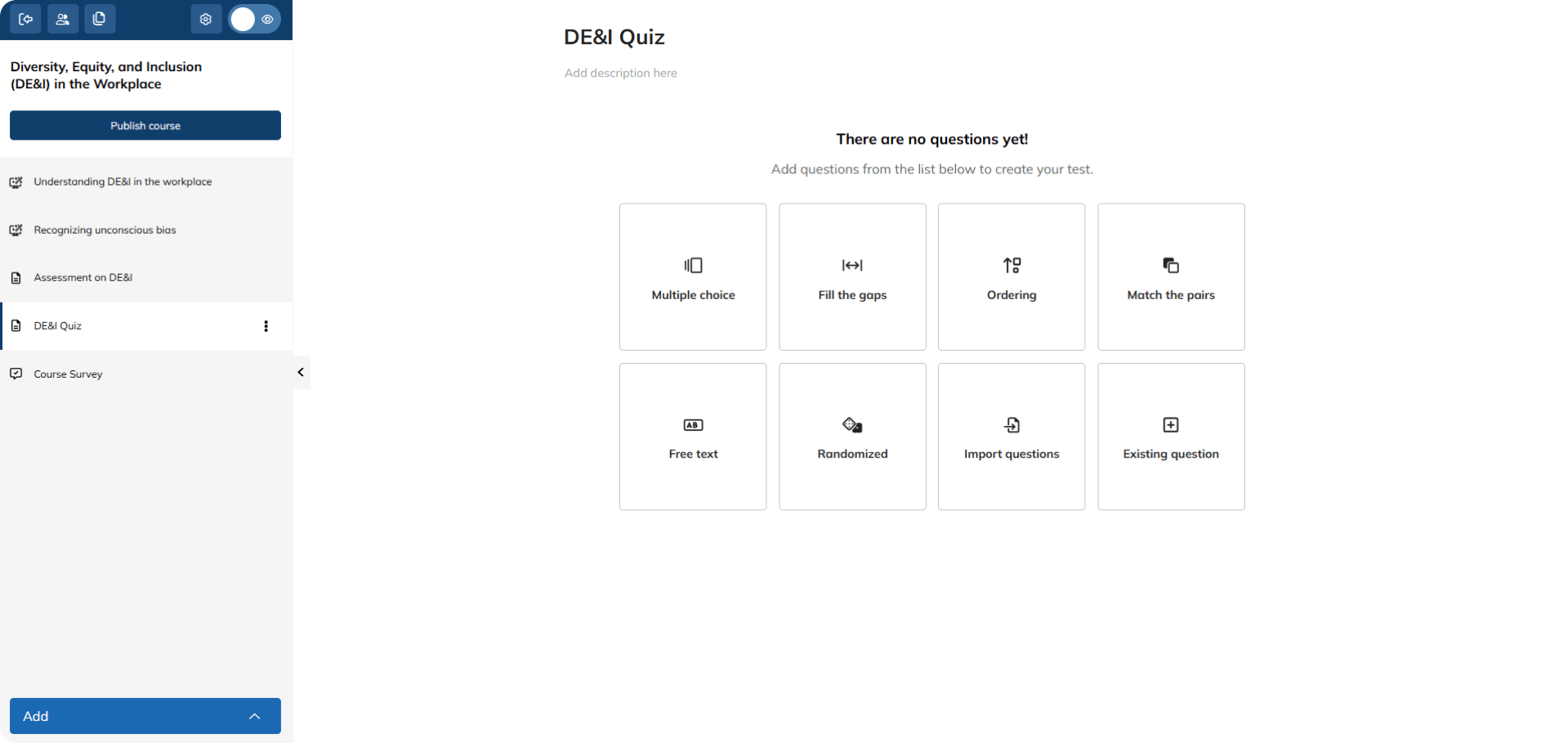
Essential checkpoints, assessments are an invaluable part of training. However, managing them manually takes time and effort. When they’re built into an LMS, they become a seamless part of the learning process. Automated, easy to implement, and fuelled by real-time data, the best LMS assessment features go far beyond simply grading. They give actionable feedback, pinpoint knowledge gaps, and even adapt the personalized learning path based on results.
A good LMS also supports diverse assessment types, from practical projects and peer reviews to interactive simulations.
Plus, there are advanced LMS features that offer a wide range of tools to help with assessments.
For instance, you could create a scenario-based assessment where learners apply their knowledge to a realistic workplace situation. The system would track their responses, give feedback automatically, and even let the instructors grade more complex parts, like written responses or project submissions, by hand.
Loved by…
- Administrators: Automated assessments produced by this LMS feature save time by streamlining grading and reporting. Analytics provide clear insights into learner progress and skill gaps, helping to refine training strategies.
- Learners: Instant feedback and personalized assessments help learners track their progress, reinforce key concepts, and master the course material. They also stay motivated with a clear understanding of their strengths and areas for improvement.
- Instructors: Built-in assessments allow instructors to measure comprehension in real-time, adjust content as needed, and ensure learning objectives are being met—without the hassle of manual evaluation.
Collaboration tools
An LMS should feel like a team workspace, not a lonely island. That’s where collaboration tools come into play.
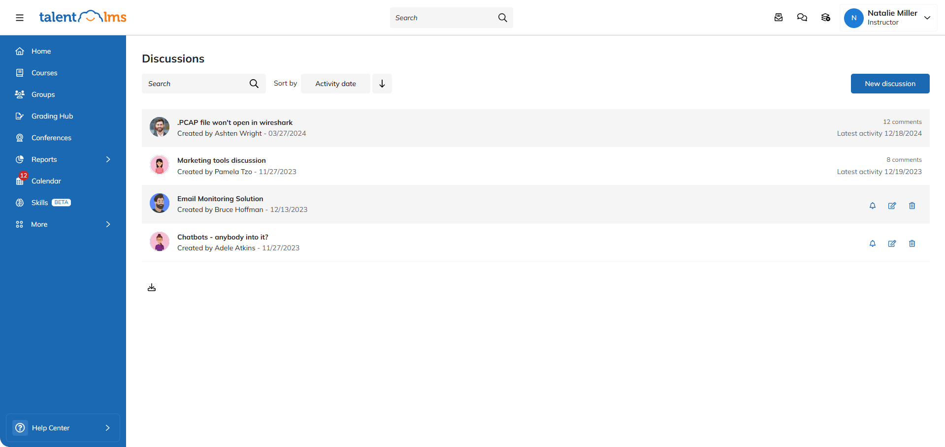
Forums, group projects, messaging, and videos are how learners connect, share, and learn together.
In a good LMS, you’ll typically find course forums for questions and sharing, project spaces for group work and communication, and often, hook-ups to tools like Slack or Teams.
Loved by…
- Administrators: By facilitating peer interaction and knowledge exchange, this LMS feature encourages a culture of continuous learning. This leads to higher engagement, learning retention, and course completion rates.
- Learners: This LMS feature is huge for learners. It fights isolation, gets everyone involved, and lets people learn from each other’s viewpoints. It also builds a supportive continuous learning community.
- Instructors: Enabling real-time discussions, group activities, and feedback loops, this LMS feature ensures learners actively participate in the learning process. Which boosts training effectiveness.
Content library
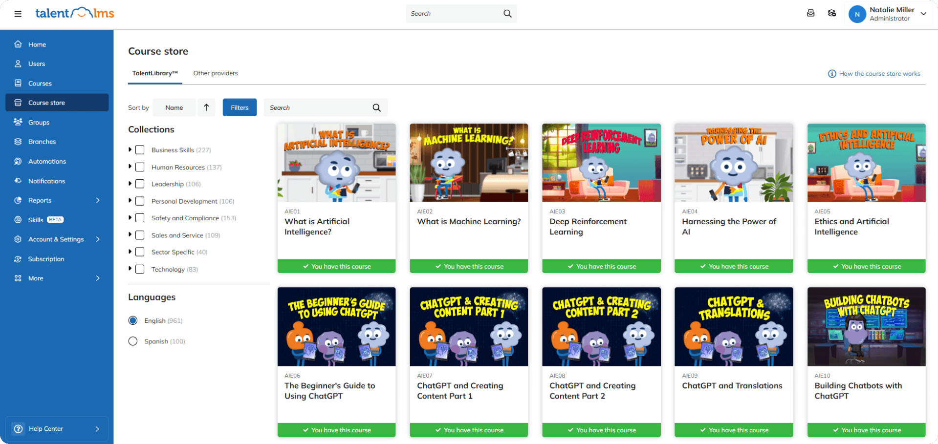
An LMS content library is a well-organized, always-available digital resource hub. It’s where all your learning materials live – courses, videos, documents, and more.
The key draw of this feature is its easy access and discoverability. A new salesperson can quickly find training materials and product guides. A new techy who needs to learn about coding for a new project knows where to go for guidance.
Other key features often include robust search, tagging and categorization, and version control.
Some libraries also support different content formats – SCORM, xAPI, PDFs, videos, and more.
Loved by…
- Learners: Using a content library, learners can easily access training materials. They can benefit from self-paced learning. And explore topics relevant to their roles, skills, and career growth.
- Instructors: By supplementing custom content with a library of expert-developed courses, instructors can enhance training programs with minimal effort.
Course creation
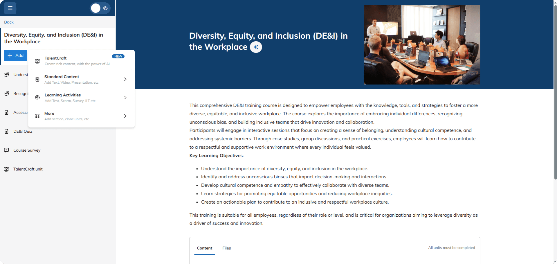
A powerful LMS features tools that help you build impactful courses, efficiently.
The value of this feature lies in creating engaging, interactive learning experiences that bring results.
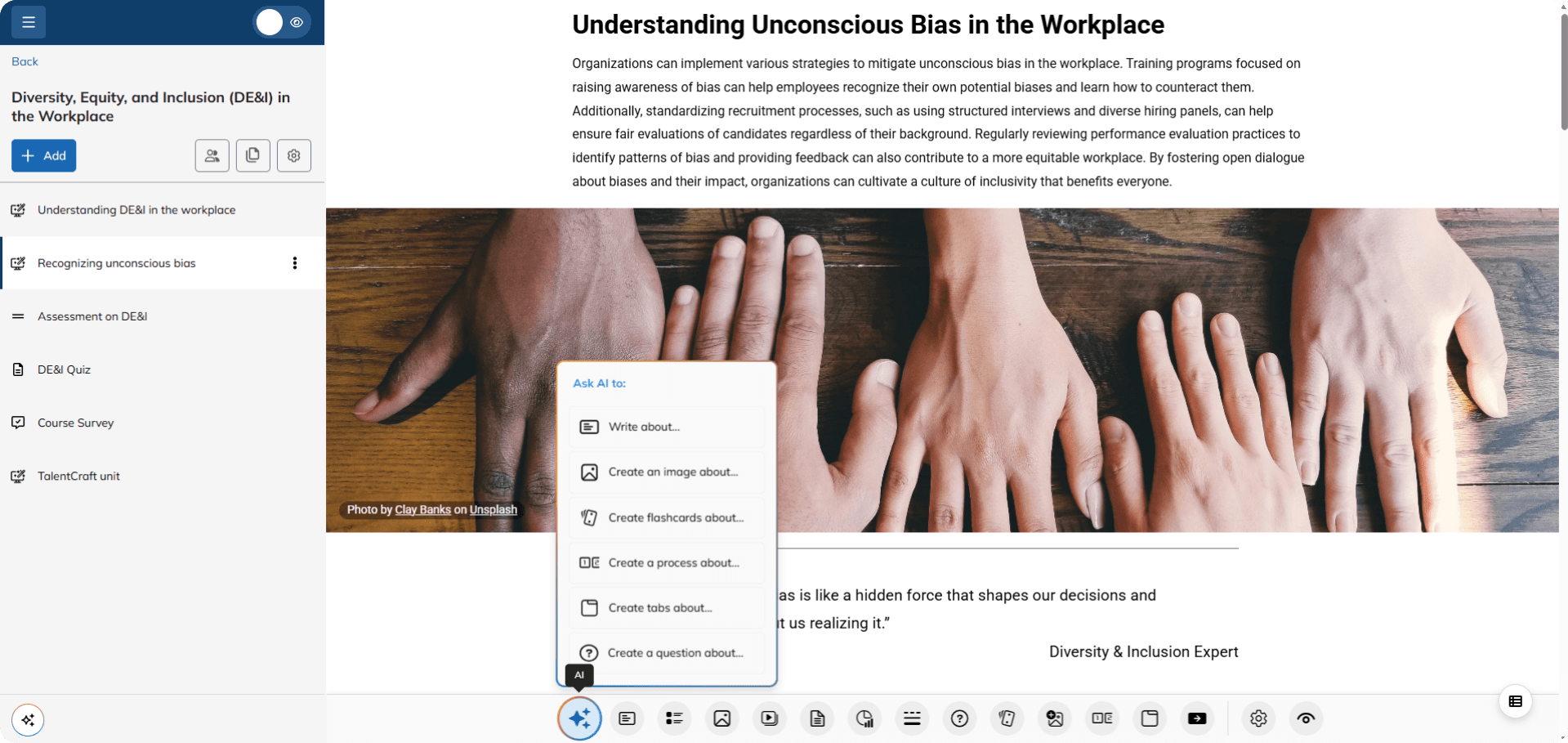
With a good LMS, you can create a blended learning experience using videos, quizzes, downloadable resources, and discussion prompts.
You should also have easy-to-use features like drag-and-drop interfaces, pre-built templates, and support for various media types.
Some LMS providers now offer AI help for tasks like making course plans, summarizing content, or even making quiz questions from existing materials.
Loved by…
- Administrators and instructors: With control over training content, boosted by AI functionality, L&D professionals can create high-quality content faster and more efficiently. And benefit from the flexibility to update course materials, ensuring content remains current, and aligned with learner needs.
Course management
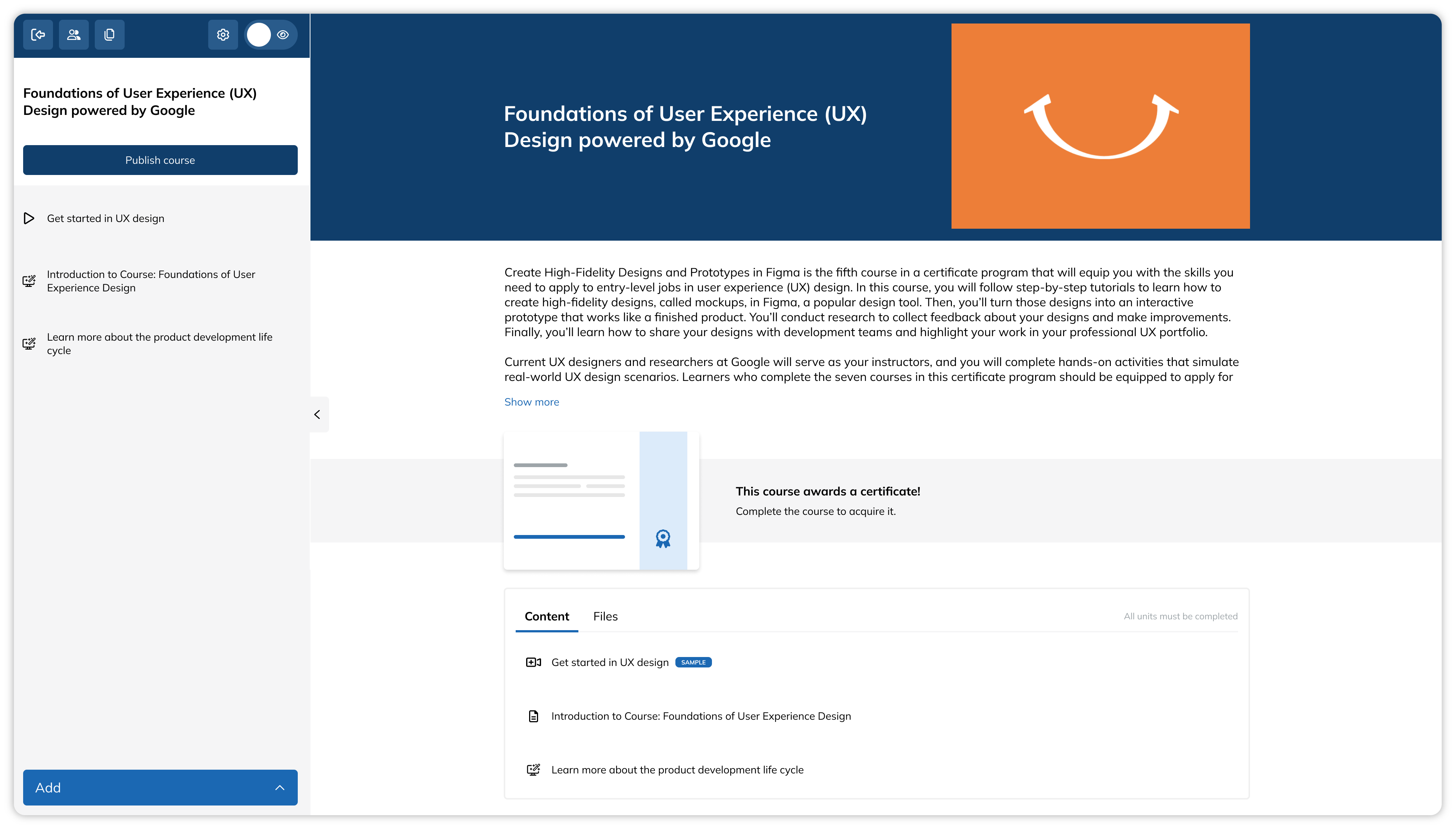
Course management is what goes on behind all the learning and course creation.
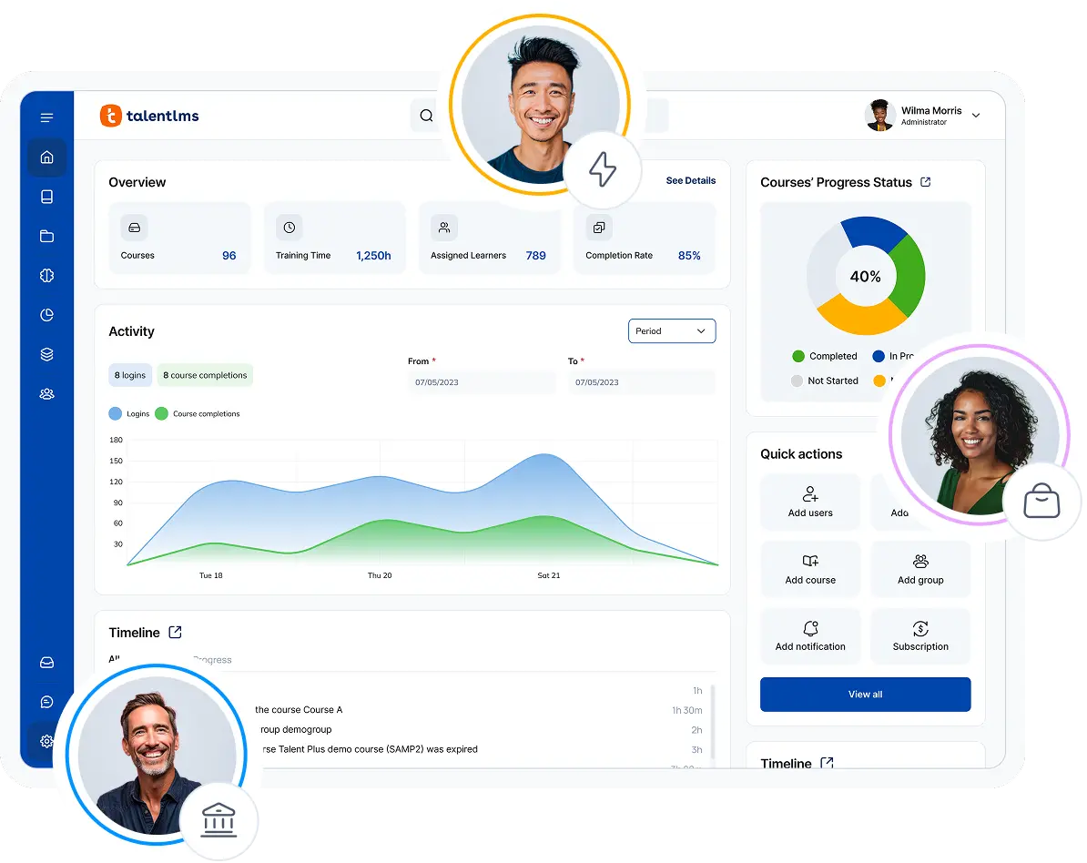
It’s like mission control for your training programs. It helps you ensure the right people get the right training, right on schedule. And gives you the data to show it’s working.
Look for automated enrollment, progress dashboards, custom notifications, and robust reporting. Being able to group
learners (for example, by department or role) is key for delivering targeted training.
Loved by…
- Administrators. Cutting down on paperwork, and manual errors, this LMS feature automates the admin and keeps everything compliant. Plus, it provides the hard numbers to prove training ROI.
Customization
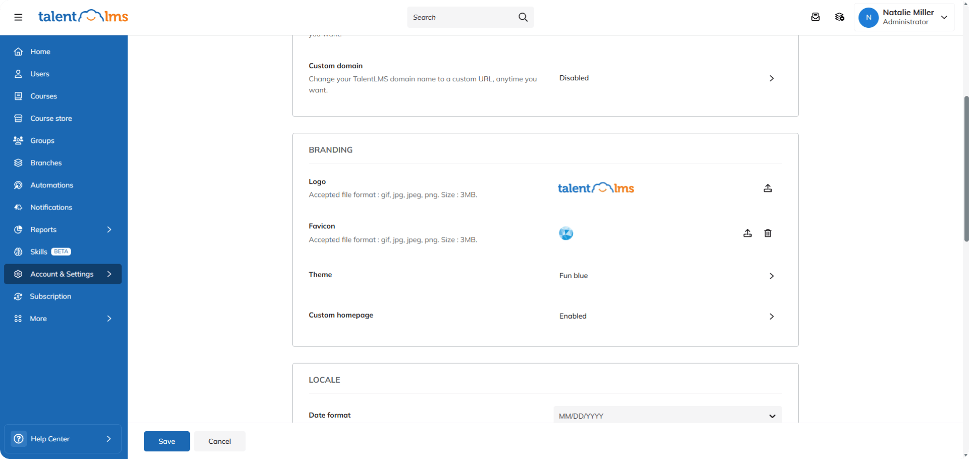
Customization in an LMS means shaping the platform to fit your specific needs and brand, not the other way around. It’s about creating a learning environment that feels truly yours.
This delivers a consistent brand experience and empowers you to tailor the learning journey for different roles and teams.
A company should be able to brand its LMS with its colors and logo, create custom dashboards for different departments or branches, and set up unique learning paths for various job roles.
Look for options to customize the look and feel, configure workflows, and integrate with other systems. The ability to add custom fields and reports is also a big plus.
Loved by…
- Learners: Customized learning paths, branded interfaces, and relevant content, combine to deliver a more personalized journey. Which, in turn, makes training more engaging and meaningful for front-end users.
- Instructors: Access to features that tailor course materials, assessments, and feedback options, means course leaders can better address individual and group learner needs. And optimize training effectiveness.
Pro tip: Customization features are particularly helpful for larger or rapidly scaling organizations and those with unique or multipurpose training needs. Branch functionality, in particular, means businesses can organize training into independent and uniquely branded sub-portals to suit the needs of different groups, departments, or learning styles.
Gamification
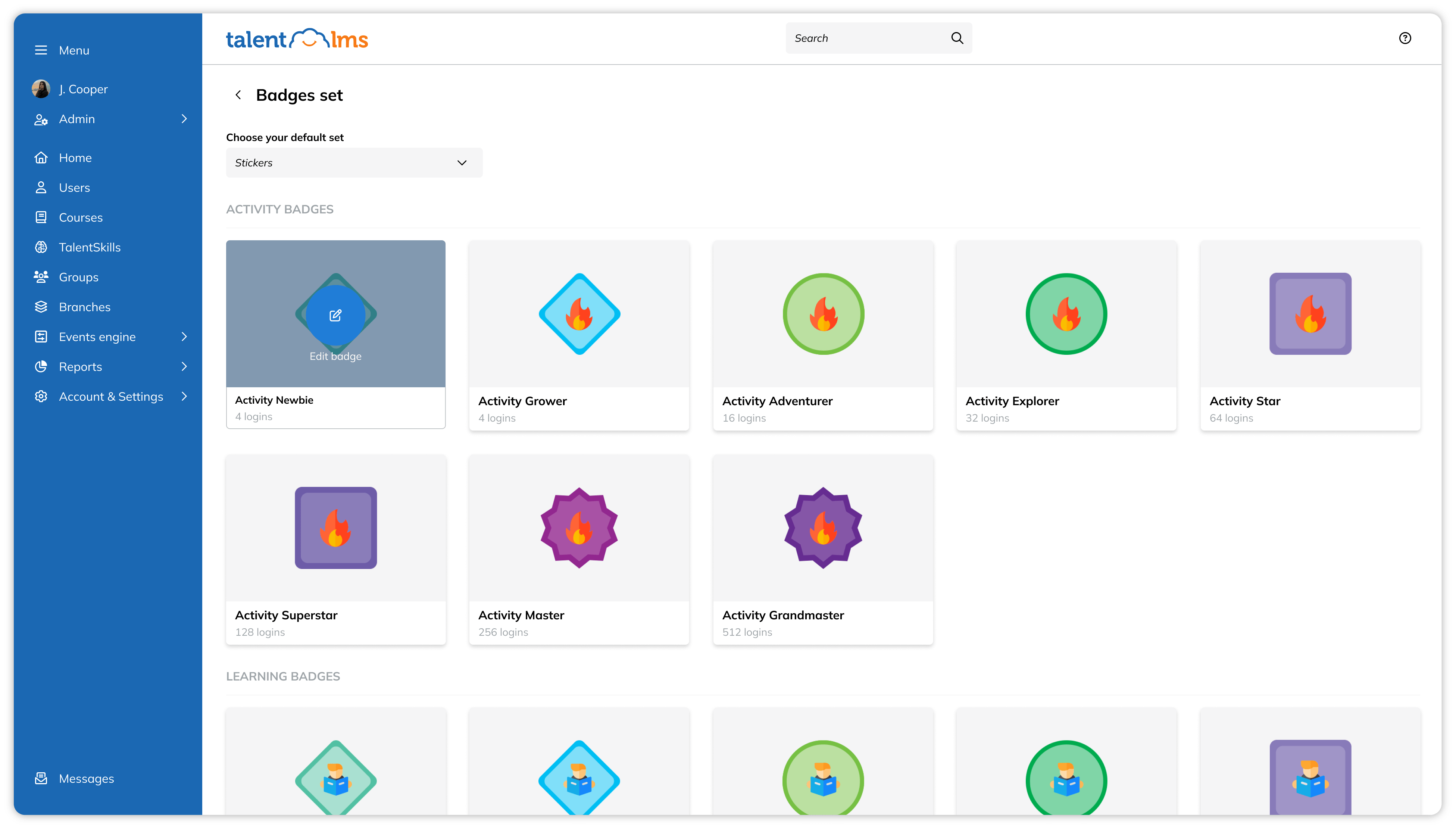
Gamification in an LMS enhances learner engagement and reinforces knowledge retention.
The true power of gamification lies in tapping into our natural desire for achievement, competition, and reward. An employee can earn points for finishing courses, unlock badges for learning skills, and compete with their coworkers on a leaderboard.
When evaluating an LMS, look for features like:
- Points and badge systems
- Leaderboards
- Progress bars
- Levels, and challenges
- The ability to customize these elements
Loved by…
- Learners: This LMS feature is most loved by learners, especially those who thrive on friendly competition or enjoy visible progress markers.
Integrations
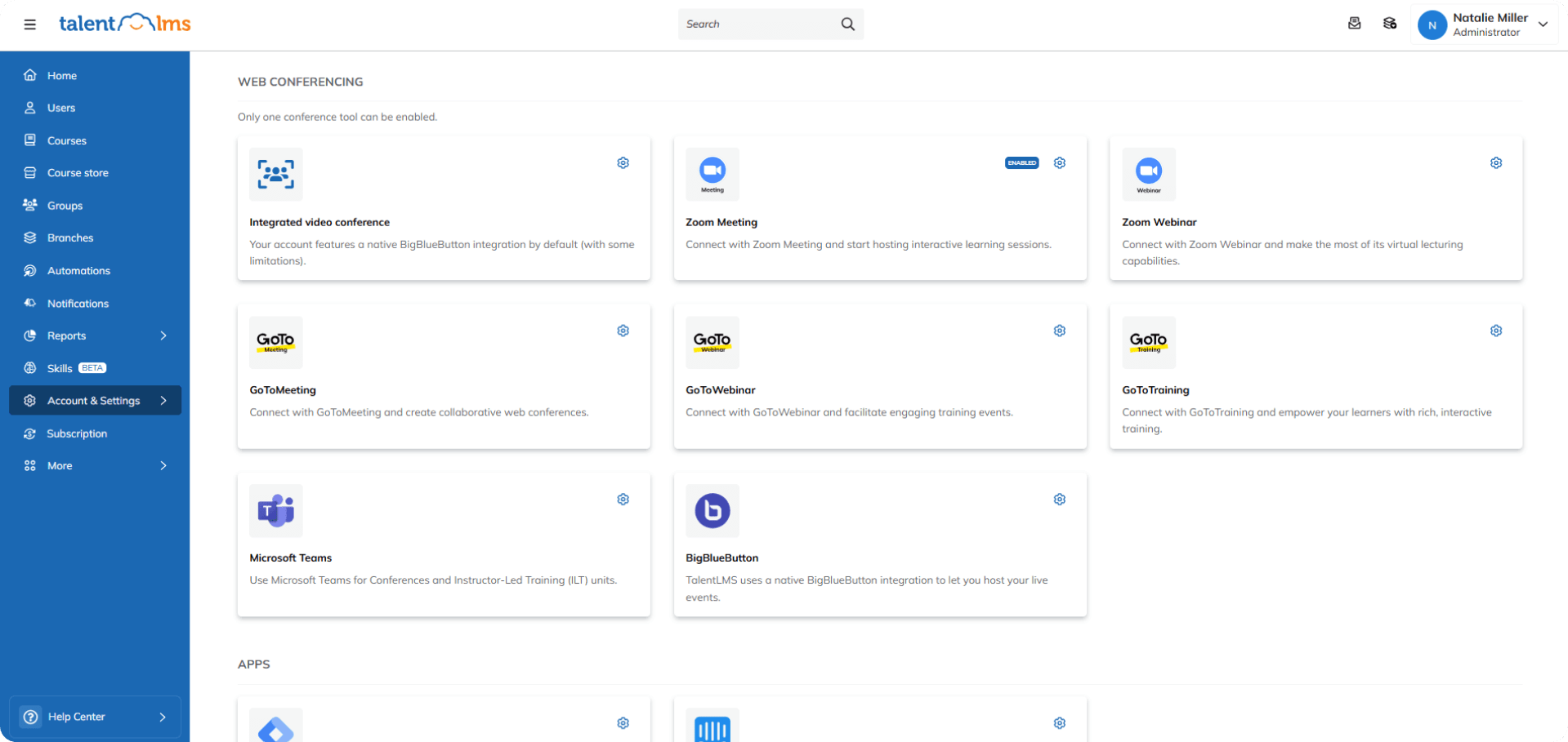
Integrations help your LMS play nicely with your other HR systems.
This is a huge time-saver, reducer of errors, and simplifier. Think of employee data flowing automatically from your HRIS to your LMS – no more creating accounts by hand.
Key connections to look for:
- Human Resource Information Systems (HRIS)
- Customer Relationship Management (CRM)
- Communication tools (like Slack or Microsoft Teams)
Loved by…
- Administrators: Syncing data across multiple platforms, reduces manual work and ensures consistency in user management, reporting, and tracking.
- Learners: Integrating training with familiar tools like email, collaboration apps, and content providers, provides a smoother learning experience for employees.
Learning paths
Learning paths are personalized career and skills roadmaps for employee growth. They guide learners through a set sequence of courses and materials, designed to build specific skills or reach specific goals.
They’re great for employee onboarding, skill-building, and career advancement. For example, new sales reps might follow a path covering product training, sales techniques, and CRM use, getting them fully prepared for their role.
Key features should include building custom paths, assigning them to people or groups, and tracking progress. It’s also important to be able to include different content types (for example, courses, videos, documents, quizzes).
Loved by…
- Administrators: This LMS feature saves admins time by automating course assignments and progress tracking.
- Learners: Tailored to their role or development plan, learning paths provide a clear, step-by-step path to growth. This makes skill-building more intentional and rewarding for learners.
- Instructors: Customized learning paths help instructors see where they need to offer additional support or more challenging content. This leads to better learning outcomes.
Notifications and reminders
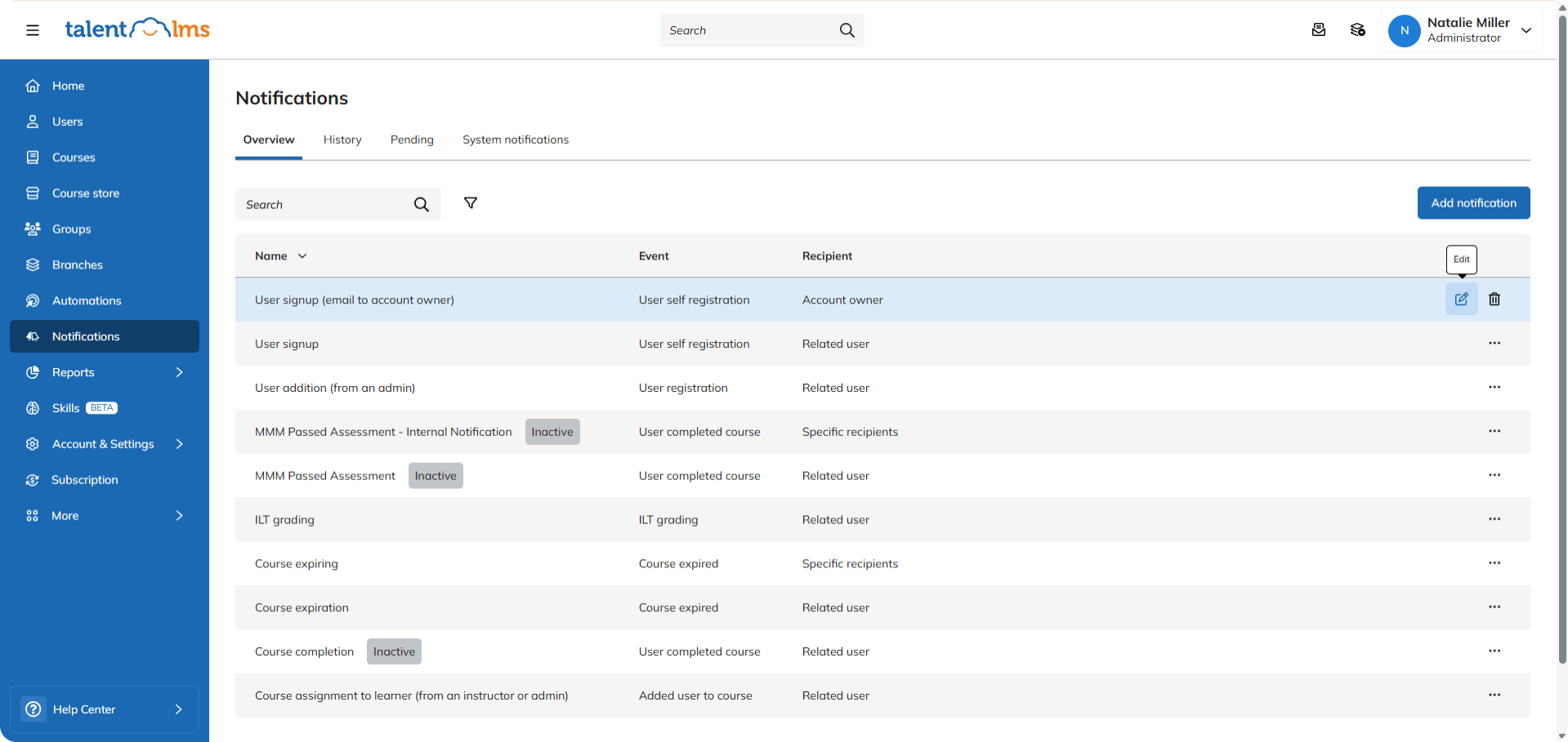
Notifications and reminders features in an LMS keep everyone on track and informed. They’re the gentle (or not-so-gentle) nudges that ensure learners don’t miss deadlines or forget about training.
They’re useful for improving course completion rates and keeping learners engaged.
They also eliminate the excuse of “I forgot!” A learner receives an email reminder about an upcoming deadline for a compliance course, prompting them to complete it on time.
Look for customizable notification triggers (upcoming deadlines, new course assignments, overdue tasks) and delivery methods (email, in-app messages, push notifications).
Loved by…
- Administrators: Automated reminders and notifications take the pressure off training admins and help ensure training compliance.
- Learners: Timely alerts reduce the risk of missed opportunities for learners.
Instructors: Automated reminders improve participation and learner accountability, which are key areas of concern for training instructors.
Reports
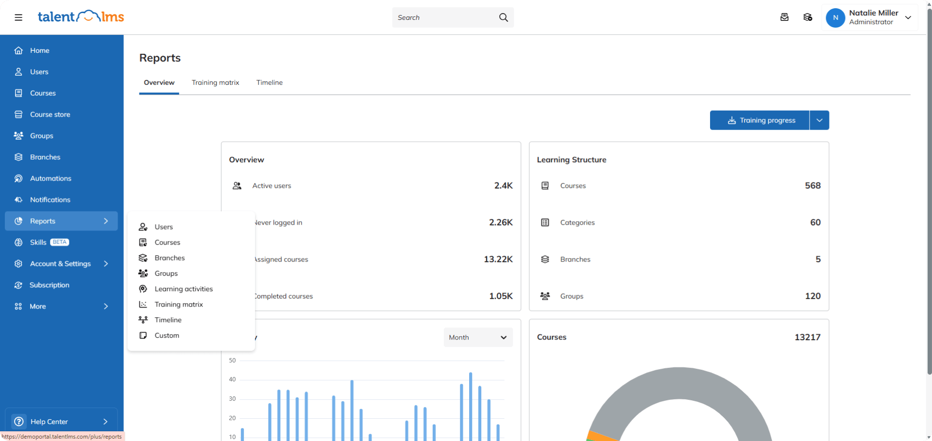
LMS reports turn training data into something you can use.
They help HR and learning leaders make smart decisions, find areas to improve, and prove the value of their training programs. For example, a report with high completion rates and great scores for a new sales training, confirms it’s a success.
Look for customizable dashboards, ready-made report templates, and the ability to export data. Tracking for things like course completion, learner progress, scores, and time spent learning is also key.
Loved by…
- HR managers, L&D professionals, and administrators: Automated reports give admins the data needed to measure training impact, tweak programs, and share the ROI of training with key stakeholders.
Skills management and mapping
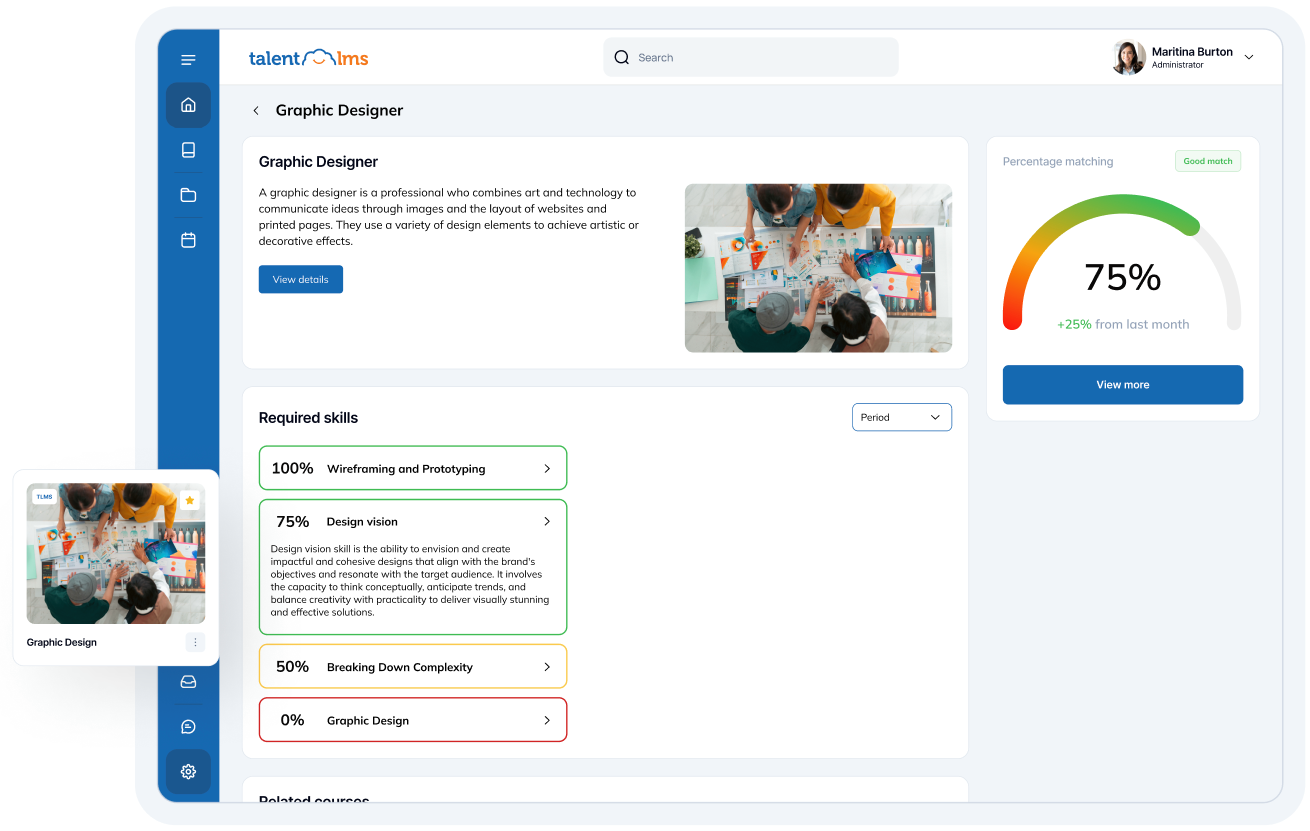
Skills management and mapping features in an LMS help you identify, track, and develop the skills your employees have and the skills they need.
This helps you make better decisions about training, hiring, and promotions.
Look for features that let you define skills, assign them to roles and individuals, track skill gaps, and create development plans. Integration with learning content is also important to look at, so training can directly address identified needs.
Loved by…
- HR managers, L&D professionals, and administrators: This feature is incredibly useful for anyone involved in developing a robust and relevant L&D strategy. It paints a clear picture of workforce capabilities, helps target training effectively according to business objectives, and supports effective talent management.
SSO/Security
Having top-notch security is non-negotiable. It safeguards employee information, protects intellectual property, and builds trust.
SSO (Single Sign-On) makes logging in simple and secure. An employee uses their usual work login to access the LMS – no more extra passwords to remember (or forget).
Look for features like:
- SSO integration (with providers like Okta and OpenID Connect)
- Data encryption
- Role-based access control
- Regular security audits
- Compliance with relevant data privacy regulations (like GDPR or CCPA)
Loved by…
- Administrators: Integrating with existing authentication systems, SSO simplifies user management and provides peace of mind for learning admins. It also supports compliance and reduces potentially time-consuming login issues.
- Learners: Employees can access training content quickly and securely without juggling multiple passwords.
Surveys
Surveys within an LMS give learners a voice, which helps improve the learning experience. They give you direct insights into what’s working and what’s not.
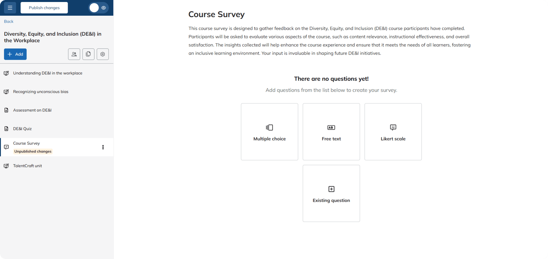
They’re great for gathering feedback, measuring learner satisfaction, and identifying areas for improvement. An administrator could, for example, send out a survey after a course to analyze learner understanding, identify any confusing sections, and gather suggestions for improvement.
Look for features that help you create different question types (for example, multiple-choice, rating scales, and open-ended formats), customize survey design, and analyze results.
Loved by…
- Instructors and L&D professionals look to this feature to improve training quality, boost success and completion rates, and raise learner engagement.
User management and roles
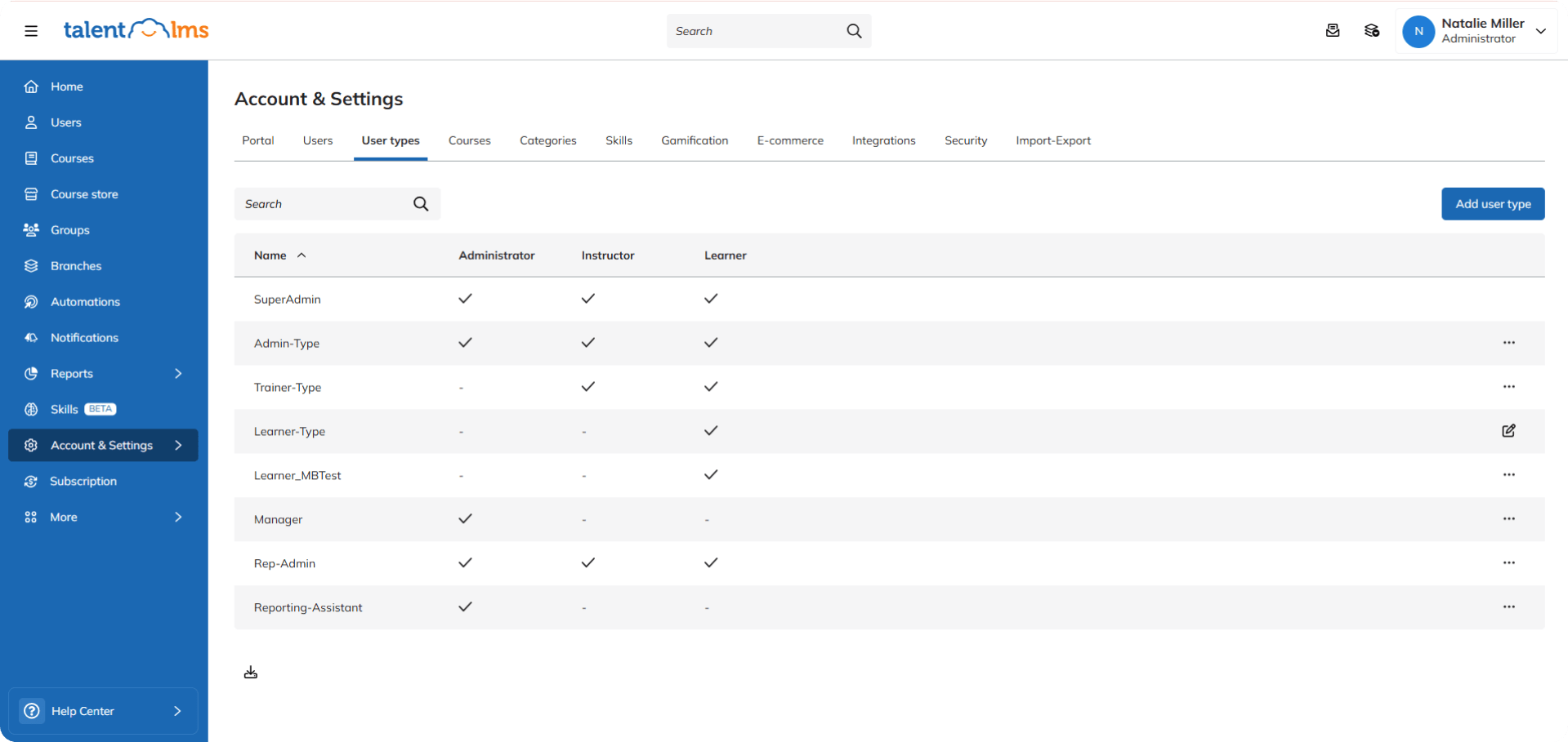
User management and roles in an LMS are about organization and control. They govern who can access what is within the system.
For example, different roles (learner, manager, administrator, and instructor) would be assigned varying levels of access and permissions. Learners can only access assigned courses, managers can track their team’s progress, and administrators can manage all aspects of the system.
Once in place, they continue to run without the need for manual intervention.
Look for features like:
- Bulk user import
- Role-based access control (RBAC)
- Customizable permissions
- The ability to create custom roles
- Easy user provisioning and de-provisioning
Loved by…
- Administrators: Being able to set up and run access controls takes the burden off learning admins. They can ensure the right people have the right level of access without having to manage anything manually.
How LMS features can be adjusted at any company level
A truly versatile LMS offers features that can be scaled and adapted to meet the unique needs of both small businesses and larger enterprises.
Here’s how some key features can be adjusted to support employee training in both instances:
AI
SMBs: A small business owner might use AI-powered features to automatically suggest relevant courses to new hires based on their job title.
Enterprise organizations: A bigger company might use AI to look at skills gaps across the whole company, predict future training needs, and make learning paths for thousands of employees unique. They might even use AI to generate custom learning content.
User management and roles
SMBs: In small businesses, the owner, or office manager might be the LMS admin. They need to be able to add new employees, assign them to a standard onboarding course, and check completion reports.
Enterprise organizations: In bigger businesses, an HR manager might use the LMS to assign specialized training paths to different departments. Department heads can then monitor their team’s progress and even assign additional, role-specific online courses. Access is carefully controlled based on job function.
Course management
The owner or manager might use the LMS to give all employees a course that they must take. Then, they might check a simple report to make sure everyone has finished it by the deadline.
A department head might use the LMS to assign specific technical training courses to their team members, track their progress, and even create custom learning paths. HR can then oversee overall training completion rates across the entire organization.
Reports
SMBs: The owner of a growing start-up might check a weekly report to see who’s completed the mandatory safety training. They’re looking for overall compliance and identifying anyone who’s falling behind.
Enterprise organizations: In an established enterprise, a training director might use special reports to look at how well they create training programs in different areas. They might look for links between training completion and performance metrics. And then integrate this data with their HRIS to inform talent development strategies.
Learning paths
SMBs: A small company might create a single, standard learning path for all new hires, covering essential company policies, procedures, and basic job training.
Enterprise organizations: A large corporation might create multiple, role-specific learning paths geared to different departments and career levels. Employees might have personalized paths that adapt based on their performance, skills gaps, and career goals.
How to choose the best LMS for your team
Choosing the right learning platform is the difference between your organization having a learning solution and a learning problem.
As we’ve seen, the best LMS has to have all the right features, implemented in a way that aligns with your specific needs and goals.
When making your choice, consider your current training needs, your anticipated future growth, and the level of technical expertise within your organization.
A perfect platform will grow with you, adapting to your evolving needs and helping you build a thriving learning culture.
Ready to find the perfect fit? Explore these resources to learn more:
FAQs
What is an LMS?
A Learning Management System (LMS) is employee training software that helps you create, track, manage, and deliver training programs.
What are the benefits of an LMS?
It saves time and money by centralizing all your training. You get better results because learners are more engaged, and you can track progress to see exactly what’s working and where you can improve. Plus, it helps ensure everyone’s up-to-date on important training, like compliance.
Popular use cases of an LMS
Think onboarding new hires, making sure everyone’s compliant, training your sales team, teaching customers about your products, or developing leadership skills. It’s versatile and can handle most types of corporate training.
What makes an LMS good?
A learning management system should fit your company like a glove, be super easy for everyone to use, and connect with other relevant systems in your toolkit. Most importantly, it should give you the data to prove your training is making a real difference.
| Tags: LMS features,top LMS

