When it comes to new niches in a free-market economy, opportunities are gold. The fine line between what is enough and what is too much is where some Learning Management Systems have failed to adapt to the growing need of people to transition to eLearning.
eLearning is becoming more prominent by the day, as companies use eLearning to do training, Universities use it to supplement coursework, and people like you and me use it because we now have the opportunity to take a class out of the ordinary, for free! More and more people want to jump on the bandwagon for one reason or another, convenience, affordability, easy content creation, adapting to the times; call it what you want, but eLearning has been established in both the worlds of education and technology as a hot topic.
So what do all the people who want to do eLearning have in common?
They will all use some form of a platform to facilitate the learning process, whether that is on a mobile, a pc or a tablet computer, the platform is the mediator between professor and learner, and the simpler it is, the more engagement you are likely to achieve.
Why?
We are simple beings. We have the ability to achieve amazing feats, no doubt, but at the core of our existence, we have been simple species. There is no reason to assume that the average user out there would want to burden themselves with the added weight of a cluttered or “noisy” system.
What I did..
Putting on the client’s shoes, I ventured around the market to see what’s up. Not that it’s a newly practiced method to compare and contrast – it’s the end all be all means of measuring success in my opinion. Even if you are the best, it’s likely that the second best gave you that place.
What I realized..
Looking at our competitors serves two purposes.
It’s both a learning process and a way to reflect on tactics employed.
When asked to suggest changes, both functional and aesthetic, I find myself asking questions like these…
“We have an amazing feature, but are we portraying it the best way possible?”
“Is this button where it’s meant to be to ensure maximum visibility?”
“Will the client feel good about moving his mouse so far away to move to the next unit?”
“Are all those features absolutely required to maximize the efficiency of the instructor and the learner?”
“Will this be used well enough? Will it be abused?”
There is a series of different paths you can go down when looking at your product and the ways to improve it. Some might say that the more paranoid you get about it, the more imperfections you will iron out before taking a feature live.
We recently released the new version of TalentLMS, 1.9, and it was about a series of changes, improvements and additions we implemented as a response to the needs we see our users have… yet no matter how new, innovative and glossy something is, the silver lining is in the details, and the magic is in the basics.
This is dedicated to the three features that I believe make the difference when it comes to an amateur instructor who aspires to become a professional trainer.
The chasm between the two is that the former is well… an amateur; his content is most likely new, some might even be in the building process still, and his methods are in the infancy stage.
The professional trainer on the other hand (or any professional for that matter) is someone who has reached his level of competency after years upon years of work and accumulation of experience. It’s no question that the amateur instructor will need a few stepping stones or “friendly pushes” to get going before he has his own platform screaming his name, and his name alone.
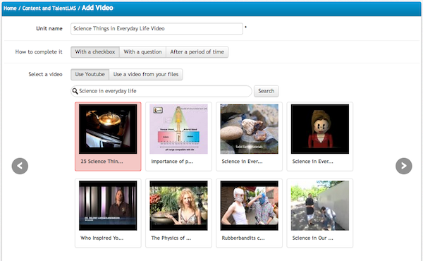
Embed Video from YouTube
YouTube packs a huge wealth of information, and it won’t punish you for searching the wrong term. Spelled it wrong? Who cares… It will auto-correct by approximation (based on the most popular results) and give you a pool of results to choose from, and embed on your content page.
Is YouTube not enough? Well, it shouldn’t be!
One should use such means to complement the content. If anything, all teachers in school used the same books, what made them different from eachother was the way they explained things, and the way they engaged students, which is a whole different story.
As far as covering content goes, this hits bullseye, because it allows anyone to have easy access to content and then build upon that in order to personalize the content and offer his own insight on whatever is being presented.

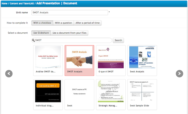
Getting serious? Why not try SlideShare?
I once registered on SlideShare… I used it to find academic presentations by professors from other university networks I was interested in. Over time, people have started following me on SlideShare without me doing much – I actually never shared much myself; I had the passive role of the viewer and that was it. But I realized a pattern. Slideshare is to presentations what LinkedIn is to Facebook. Anyone can join, but people tend to use it for professional work and presentations they want to share with a specific group of people, or enthusiasts of a specific kind.
You can search and automatically embed SlideShare presentations into a unit. Just like when adding a YouTube video, you can add your own text, content, pictures and other elements to complement the presentation and give it your own twist.

iFrame
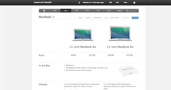
This is one of those features I love using. It practically allows the instructor to embed a(ny) website within the Unit Page, so the learner doesn’t have to leave the platform to view that website. For example: You want to reference a law, a manual or simply another website? Frame that website within your unit page and your learners will be able to use it along with all of its features without ever leaving TalentLMS. That way you can ensure that learners are not distracted by opening many different pages at the same time and deviating from the essential content.
Just like the embedding features for YouTube and SlideShare, you can add and complement the embedded page with your own notes and formatted material using TalentLMS’ text editor.


Tell us, what feature makes your life easier?